What Is a Triangle Pattern?

A triangle pattern is a chart formation in which successive highs and lows converge, narrowing the trading range over time. It describes compressing volatility rather than direction, and the shape itself carries no information about which side the eventual break will take.
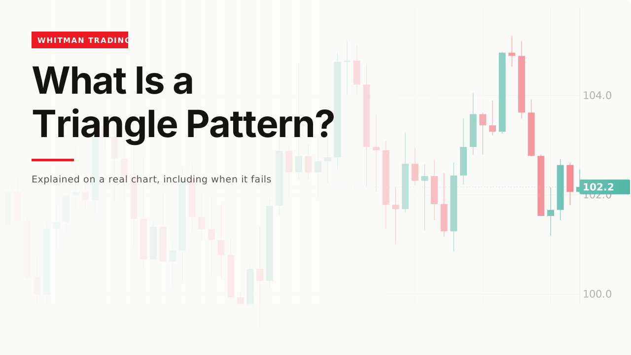
Covered on this page: TradingView.
A triangle is what a chart looks like when each swing is smaller than the one before it. That is a real, observable thing. The directional forecasts attached to it are a separate claim and a much weaker one.
How it works

Draw a line across the highs and another across the lows. If the two lines converge rather than run parallel, the range is narrowing and the shape is a triangle.

Three named versions exist. A flat top with rising lows is ascending; a flat bottom with falling highs is descending; both lines sloping toward each other is symmetrical.

All three describe the same underlying fact. Each successive swing covers less distance than the one before it, which means volatility is falling while price stays in one area.

What it does and does not tell you

The compression is real information. Ranges do not narrow forever - at some point the lines meet, and before that price has to leave.

The direction is not in the shape. An ascending triangle is called bullish because the lows are rising, which is a description of what already happened inside the range rather than a statement about the exit.

And the apex is a deadline, not a target. Where the lines meet is the last bar at which the pattern can still exist, and price generally leaves well before then.
A worked example
Say a range is 4 points wide and narrows to 2 over twenty bars. Each swing high is lower than the last and each low is higher, so both boundaries are moving toward each other.
The useful number is the width at the moment you act. If you enter on a break of the upper line, the lower line is where the pattern is wrong, and 2 points is what the idea costs if it fails.

That is the whole practical value. A narrowing range puts your invalidation closer to your entry than a wide one does, which improves the arithmetic of the trade regardless of direction.
It does not improve the odds of being right. Compression tells you a move is coming and stays silent on which way, and a tighter stop on a coin flip is still a coin flip with a tighter stop.
The original data
On this site’s shared series: median bar range 0.493, ninetieth percentile 1.101, largest bar 2.338. Direction runs average 2.01 bars with a longest of 11. A round trip costs 0.0098, about 2% of the median bar range.
A triangle needs several swings to exist, and in a series turning every 2.01 bars, swings are constant - which is why triangles can be drawn on almost any chart if you are willing to choose which highs count.
The largest bar in the series is 2.338, against a median of 0.493. A single bar can be wider than a late-stage triangle, so a break that looks decisive on the chart may be one ordinary large bar rather than the start of anything.

The volume claim
The textbook version says volume falls through the triangle and expands on the break. It is the most repeated piece of advice attached to the pattern, and it has a sensible reason behind it.
Falling volume is consistent with compression. Fewer participants disagreeing means smaller swings, so a narrowing range and a quiet tape are two views of the same thing.
The break half is the weaker claim. Volume rises around plenty of moves that reverse immediately, so an expansion confirms that something happened rather than that it will continue.
And volume needs a baseline to read at all. Expansion relative to what - the last five bars, the last fifty, the same hour yesterday? Without answering that, a volume bar taller than its neighbours is an impression rather than a measurement.
Drawing one honestly
Require at least two touches on each line. Two points define a line, so a boundary with only two touches has not been tested - it has been fitted.
Do not adjust the lines to keep the pattern alive. A high that pokes through the upper boundary either broke it or the line was in the wrong place, and moving the line afterwards makes the pattern unfalsifiable.
Mark it before the break, not after. A triangle identified once price has already left is a description of the past, and every chart has one somewhere if you look backwards.
And accept that many are ambiguous. Real charts produce shapes that are nearly triangles, partly triangles, or triangles depending on which swing you ignore - and the honest response to an ambiguous pattern is to skip it rather than to pick the reading that suits your position.
When it fails
The characteristic failure is the false break. Price closes outside the boundary, the trade is taken, and price returns inside the range within a bar or two.
Compression makes that outcome more likely, not less. The range is narrow by definition, so the distance required to look like a break is small - and on this site’s series the ninetieth-percentile bar alone is more than twice the median, which is enough to clear a late-stage boundary without anything having changed.

A second failure is trading the name. Ascending does not mean up; it means the lows rose inside the range.
A third is the measured-move target, which projects the widest part of the triangle from the break and rests on nothing but symmetry.
A fourth is drawing the boundaries through wicks on one chart and closes on another, which changes where the break is.

And a fifth is waiting for the apex. By the time the lines nearly meet, the pattern has usually already resolved, and what remains on the chart is a shape with no room left in it.
Related
Support and resistance covers the boundaries a triangle is made of. Breakout covers what happens when the range ends. And trading range covers the wider family of shapes this belongs to.
Almost everything written about triangles assigns them a direction - ascending is bullish, descending is bearish. The shape is a description of narrowing range, and narrowing range says nothing about which side it resolves to. What a triangle genuinely tells you is that a move is coming and roughly how far away your invalidation is, which is useful enough without inventing the direction.
— Michael Whitman, from this video
This page is educational, not financial advice. Test every idea on your own charts before risking money. Some links on this page earn a commission if you buy through them. It costs you nothing and it does not decide what appears here or in what order — how these pages are made is set out in our methodology.