How to Use the Gann Box on TradingView

To use the Gann box on TradingView, anchor point 1 on a clear pivot and point 2 on the opposite pivot, with log scale off and the price to bar ratio locked. Then read the halfway line first, and treat every level as a place to watch for a reaction rather than a forecast.
Covered on this page: TradingView.
The Gann box is a drawing tool, so using it well is mostly about where you click. Two anchors decide every line in the grid, and a few chart settings decide whether the grid stays put while you work.
Before you start
A pivot low and a pivot high that anyone would pick on your timeframe. The box divides the move between them, so the anchors need to be points other traders would also mark: a swing that clearly turned the market, not a small wiggle.
Log scale switched off and the price to bar ratio locked. Gann tools assume a fixed amount of price per bar. A log scale changes that relationship across the chart, and so does squeezing the axes while you zoom.
A written plan for what a reaction at a level has to look like. One sentence is enough, for example “a close back above the line after trading through it.” Without it, every touch looks meaningful.
The steps
1. Pick one pivot pair on the timeframe you trade
Find the most obvious swing low and the swing high that followed it, or the reverse for a falling move. On a weekly or daily chart the pivot should stand out even when you zoom out. If you have to hunt for it, pick a different move.
2. Turn log scale off and lock the price to bar ratio
Switch the price scale out of log mode. Then right-click the price scale and choose the option to lock the price to bar ratio, so zooming changes what you see without stretching one axis against the other.
3. Select the Gann box and switch the magnet on
In the left drawing toolbar, the Gann tools sit in the same group as the Fibonacci tools. Turn on magnet mode so the anchor snaps to a candle’s high, low, open or close instead of a nearby empty pixel.
4. Click point 1 on the first pivot, then point 2 on the second
The box is drawn from exactly those two points, and both its price range and its time span come from them. Zoom in on each anchor afterwards to confirm it landed on the wick you meant.

5. Check both anchors in the Coordinates tab
Open the drawing’s settings. The Coordinates tab shows price 1 and price 2, each as a bar number and a price, so you can type exact values instead of trusting your mouse.
6. Set levels, labels and background in the Style tab
Checkboxes turn each price and time level on or off, with a color and opacity for each. Label switches put the level values on the left, right, top or bottom, and two sliders control the background shading.
7. Turn Angles on only if you use the diagonal rays
The Angles option draws the corner rays across the box, and Reverse flips the drawing around its main points. Leave both off if you only trade the horizontal levels, since extra lines add clutter.
8. Mark the halfway line and wait for a reaction there
Of all the divisions, the halfway line has the clearest reason to matter, because “half the move back” is how most traders describe a pullback anyway. Plan the trade only after price reacts, and set the stop from the swing that the reaction creates.
How to tell it worked
Both anchors sit exactly on a wick. Zoomed to the bar level, point 1 and point 2 each touch a high or a low, with 0 bars of drift.
The grid did not move when you zoomed. Scroll in and out 3 times with the ratio locked; the lines should stay on the same candles.
You drew it 1 time. If the anchors have been moved since the first attempt, write down why before you trust a single level.
And the halfway line is written in your plan alongside the reaction you need to see there, before price gets to it.
Why the anchors decide everything
Take a hypothetical move from $58.00 to $66.00. The box is $8.00 tall, so its quarter lines sit $2.00 apart: $60.00, $62.00 and $64.00, with $62.00 as the halfway line.
Now anchor on a slightly different low, $57.40. The box is $8.60 tall, the quarters are $2.15 apart and the halfway line moves to $61.70. A 60-cent change in one anchor moved the most important line 30 cents.
So the precision of the grid is borrowed from your click. Two traders looking at the same chart and choosing different wicks will draw two different sets of levels, and neither set is more correct than the anchors that made it.
Which is why the choice of pivot comes first in the steps. The more obvious the anchor, the more people are likely to draw the same box, and the halfway line only gets extra attention if many people are looking at roughly the same price.
The original data
This channel has published 6 videos with Gann in the title, which together have 206,794 lifetime views and 12,215 hours of watch time in the YouTube analytics export of 11 Aug 2026. Three of them name the Gann box, with 136,372 views between them.
The largest, the tutorial embedded on this page, has 113,278 views and ranks 32nd of the channel’s 498 videos. Its click-through rate is 10.24% on 793,658 impressions, against a median of 6.25% across all 498 videos.
Search supply is thin by comparison. Of the 24,971 unique videos in this site’s search study, only 4 have Gann in the title, and the one that names the Gann box is this channel’s own 2026 video. That gap between demand and coverage is what this page is for.
When it fails
The common failure is redrawing. Price cuts through the halfway line, so the box gets re-anchored on a different low until the new grid lines up with the latest bounce. It always can: any two points produce a grid, and a grid fitted after the move will describe that move.
At that point the tool has stopped planning and started explaining. The levels still look precise, which is what makes the habit hard to notice.

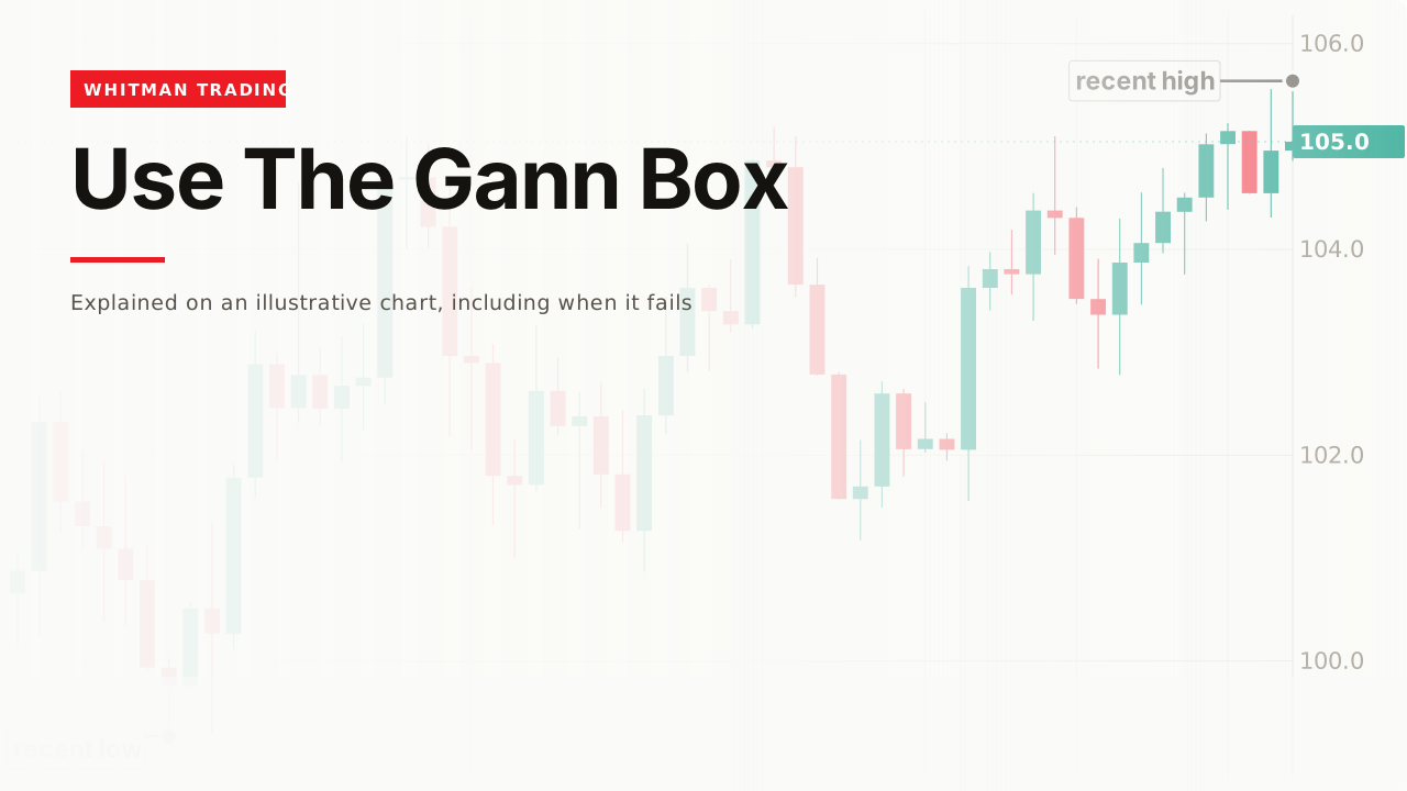
The second failure is expecting the line to hold. A level is where you watch for a reaction. On the chart above there is none: the close below the half is followed by a close below the lower quarter, and the plan from step 8 never triggers.
A third is drawing on a tiny move. If an ordinary bar spans most of the gap between two quarter lines, price crosses them constantly and none of them means anything.
A fourth is leaving log scale on, or zooming with the ratio unlocked, which bends the grid and the angles away from what you anchored.
And a fifth is stacking boxes. With several grids on one chart, some line is always near price, so every outcome looks predicted afterwards.
Related
Gann box explains what the tool is and why its levels come from your anchors rather than from the market. Gann square is the related tool shown alongside it in the video above. And Fibonacci retracement divides the same kind of move with a different set of fractions.
You’re going to be using this primarily for large levels of support and resistance. It’s not a golden bullet or a silver bullet… It’s not going to give you an answer every single time.
— Michael Whitman, from this video
This page is educational, not financial advice. Test every idea on your own charts before risking money. Some links on this page earn a commission if you buy through them. It costs you nothing and it does not decide what appears here or in what order — how these pages are made is set out in our methodology.